Friday, December 17, 2010

Foshay tower assignment

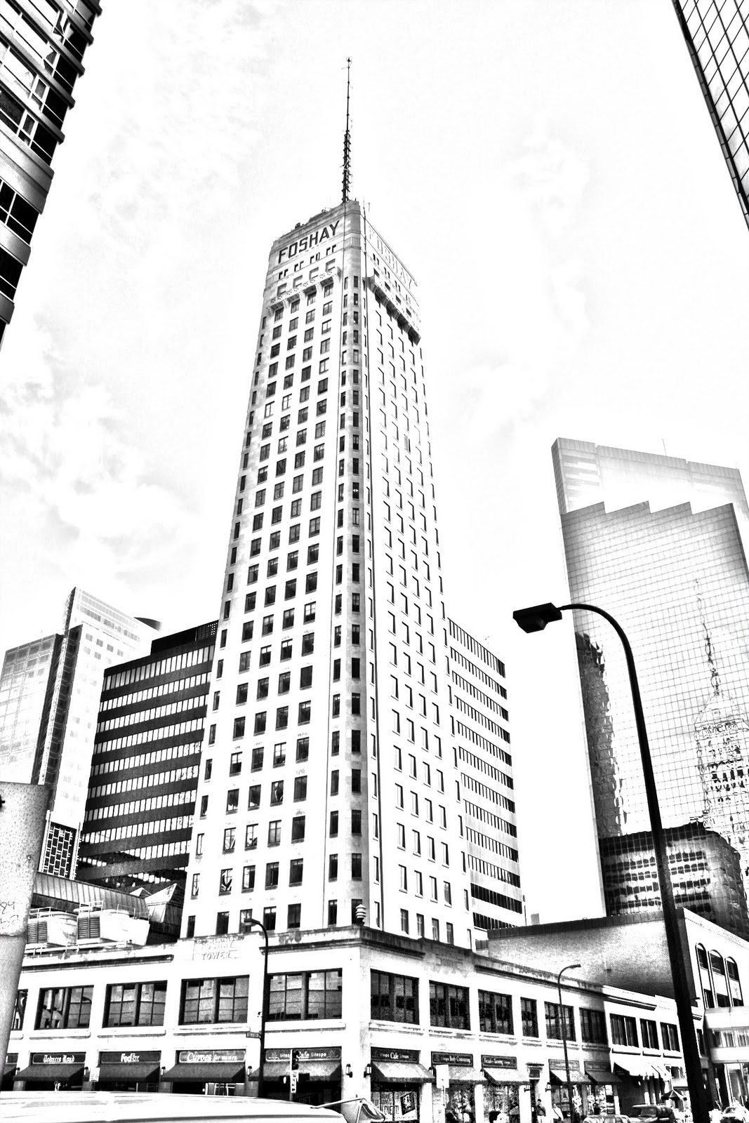
well, here is a couple images created for our Foshay tower project. I never fully finished the project, only getting 2 of the 3 pieces done, after not being able to create anything that I liked in illustrator and my frustrations with that program. I figure though that 2 is better than none, so here they are.

The first was my effort to make the image look a bit like a drawing/sketch, and wasn't entirely successful, but it turned out okay. The second was far better in my way of thinking, I had a bit of fun with it. I wasn't too sure about the font and colors, but since I had made part B/W, I decided that a red tone was what I felt like trying and I think it works ok for it.

Thursday, December 16, 2010

Final project: More fonts!

Well, here is my "mostly" finished final project. I created a series of fonts based on elements. I had initially envisioned ice, water (I know, kinda the same element really) earth and air in addition to my already created fire font.....but I struggled with air, and so pulled from (I think) Chinese belief that metal is it's own element in order to supplement the air font that I could not seem to get. I never quite was satisfied with the Ice font, and the metal font didn't come out as I had envisioned it, but I feel both work as they are, but in the future I may seek to improve upon them. Anyways, enjoy my little project here!


Thursday, December 9, 2010

Tutorial For Flaming Font!

alrighty, so here is my method for making the flame font that I used for my font project. Most everything that I need to explain is already in the tutorial. This is my first time trying to make a tutorial, so hopefully I got everything laid out in an understandable manner.

Friday, December 3, 2010

Font Project

I actually started on several different fonts for this project, but many of the petered out before they were actually completed. I couldn't really decide what I wanted to really do, but finally I remembered that a while ago I had created a flame effect for a word some time ago, and thought about what it would take to create a font specifically for that effect. So I set to work, and here is the result. Due to the process itself, it is a bit challenging to keep them all looking consistent as far as the "flames" go, but the way I think about it, is that flame is not consistent, so it fits in that way, feels more "natural".


Friday, October 15, 2010

Metaphors assignment

Well, after reading the first two assigned chapters of Metaphors We Live By, I realized a few new things about metaphors. I knew already that metaphors were important to society and people, But never really thought about how thoroughly ingrained it is into our society and even just our own thought processes. The writer gave good example of this in just how we relate "argument is war" and how it would be totally odd to us to encounter a people/society that thought of argument as a dance.  So it was an intersting read, and brought to focus the severe importance of how metaphors are ingrained in society and human system of thought.

Sunday, October 10, 2010

business card revisited

Ok, so this time around I decided that I didn't really care for the original first design I came up with. I decided that I wanted something for my photography rather than design in particular. I thought that perhaps putting a bit of my photography on the card would be a good way to advertise and also give out the information. I was unsure what type of photograph would look the best on a card, and so went about trying out several different photos that I have taken, as well as different texts and such. I am yet a bit undecided as to which is my favorite, but I think for me it is narrowed down to just two. Hopefully I can decide on one to print soon.


Friday, October 8, 2010

business card

Well, here is my business card. I really had no idea what I was trying to do with it to be honest, I mainly just experimented to try and see what I got as a result and after several nasty failures, I came up with this, which I actually liked. I As I said, it came about mainly by experimentation, and was an interesting design to arrive at. It doesn't necessarily have much to do with the photography aspect of what I do, but I figured that it didn't necessarily need to, though perhaps I am wrong about that. Anyways, here's my business card

There is Light

There is Light